Showing posts with label alcohol inks. Show all posts

Monday, February 25, 2019

It's all about the journey...

It's a new year and time is flying.  I usually start the new year off ahead of the game.  This year I am behind due to some health issues (now resolved), but am working on catching up without feeling like I have to do it all.

My last post was prior to going to The Biltmore with my niece and sister to see the Chihuly exhibit and visit some art galleries.  We had a wonderful time and it was a perfect get-a-way.  


In October, the Sanford Brush and Palette Club had its 54th Annual Art Show.  I think it was the best show so far.  This was my third year to participate.  I had been to the show about five times prior to becoming a member.

This year, my painting Rise Up and Shine received first place in the abstract category.  We are encouraged to write a statement about paintings that we submit.  You can read my statement about this one below the painting.


Rise Up and Shine
42"x29"x1"

Rise Up and Shine was inspired by the song Rise Up by Andra Day.
  
When painting abstracts, I often do not have a message or theme in mind.  I am more likely to listen to music while painting, and sub-consciously this affects the outcome of a painting.  Such is the case with this one.

Rise Up and Shine has seven layers of resin with a painting on each layer and a final topcoat of resin. I gave this one a final layer of gold and resin to bring out the shimmer.  

We rise by lifting others. Robert Ingersoll


I submitted a coffee table titled Contemplate It! for the sculpture category. It received first place in that category as well. And most importantly, it found a home!  This table had about 12 layers of resin with a painting between each layer.


Contemplate It!
40"x30"x21.5"

I also submitted the first painting from a new geometric series that I am working on.  I am enjoying this process of working on it as it is different that my usual method o painting. This painting received an Honorable Mention.  My statement about the painting is below.


Threading Geometry
24"x18"x1.75"

My favorite abstract artist is Kandinsky.  His work has influenced my paintings even though I had never worked in geometrics in the manner he did.  

I was fascinated by how he was so prolific and how much music influenced his art, and that he never repeated a painting. Only when I decided to put a different spin on my geometric paintings by doing the elements in layers so they appear dimensional did I realize that I could make thousands of different paintings, but with my spin.  

Threading Geometry is the first in a series along these lines. I chose the needle and thread as a symbol of the line that makes up all of the elements and pulls the individual elements together in this painting. 

Each of my paintings will have a theme unlike many of his and will be dimensional.  When wearing 3D glasses, the elements dance across the board just as the elements reverberate in my other ink paintings.  Without the 3D glasses, it is still easy to appreciate the layering of the elements.

I hope you enjoy a different take on my paintings!

Mighty is geometry; joined with art by a thread, resistless.
Euripedes   


I am now on my fourth painting of this series.  I will be revealing the remainder when I complete the series.

I entered two other juried exhibitions in the past couple of months.  The Fabric of Our Lives was selected for the Finalist Award for Circle Artist of the Year for 2019.


The Fabric of Our Lives
20"x20"x2"

I received a Special Recognition for the 2019 All Women Art Exhibition for The Mystery of Locus


The Mystery of Locus
40"x30"x2"

These competitions have hundreds or thousands of entries so any placement is a wonderful accomplishment.

If you are interested in any of my paintings, please feel free to contact me by email.


Wishing you an art-filled year!

Sunday, September 16, 2018

My Art Process and the Fluid Painting Process

I often receive a dozen emails in a day asking about my painting process and how I get some patterns that are not easily obtained with fluid, flow or accidental painting.

There has been a tsunami of acrylic pour paintings and fluid art painters in the past five years. Acrylic paint pouring was originally known as Accidental Art or unintentional art. There is a discussion on Quora on whether any art is intentional or can be accidental. This blog post is not really about that, but is focusing on the differences of my ink painting process and Accidental Art or acrylic fluid painting techniques. 

If you are not familiar with Accidental Art, you can get a good overview here. I must say that once most people try it, they are hooked on it!  This includes kids, people who have never painted, and people in their nineties.  I demo and teach acrylic pouring to mostly kids. Here is a photo of the kid's pours of the last demo that Elena and I did at the Chavis Community Center for the Carolina Mixed Media Art Guild.


For my process, my only pre-planning prior to painting is to have my studio clean, assemble my chosen colors, and choose my panel size. I use  Ampersand Claybord™ almost exclusively which requires no prep except for masking the sides of the cradle.

I am primarily working with the chemical and physical properties of the inks and paints to create the patterns.  The viscosity and chemical composition of the inks, the porosity of the substrate, the humidity, and the temperature in the studio affect the patterns.  I often say that how I hold my tongue in the process also affects the designs.

I rarely use a paintbrush, but instead drop, dribble, float, pour, splatter, or splash onto the substrate. However, this is not just throwing paint or ink here or there and hoping for a good composition. It is choosing the spot to drop the ink, choosing the ink that will be changed to a new color when the next ink is added, choosing the chemical compositions and the viscosities of the two inks to push the previous ink to obtain a particular pattern, and all at the same time paying close attention to how the first layer of paints or inks have begun to dry. Seconds will affect whether the intended results are achieved and which patterns are obtained. The inks must have some wetness or the second ink applied to the first drops will not allow the inks to spread to form patterns. During the process, I am continually analyzing how one area is changing and attempting to place the next inks where they do not interfere with the first inks.  This is the biggest challenge of the process. 

Some patterns are happy accidents, but I have been doing this so long that I know how many drops of one ink will force another type of ink to spread and the patterns I will get. I embrace the happy accidents and am quick to change where a painting was headed if necessary to get a good composition. Sometimes there is a point with a painting that I say to myself that this one is a lost cause.  However, one more layer and then it may very well be my favorite painting. So I don’t give up easily.

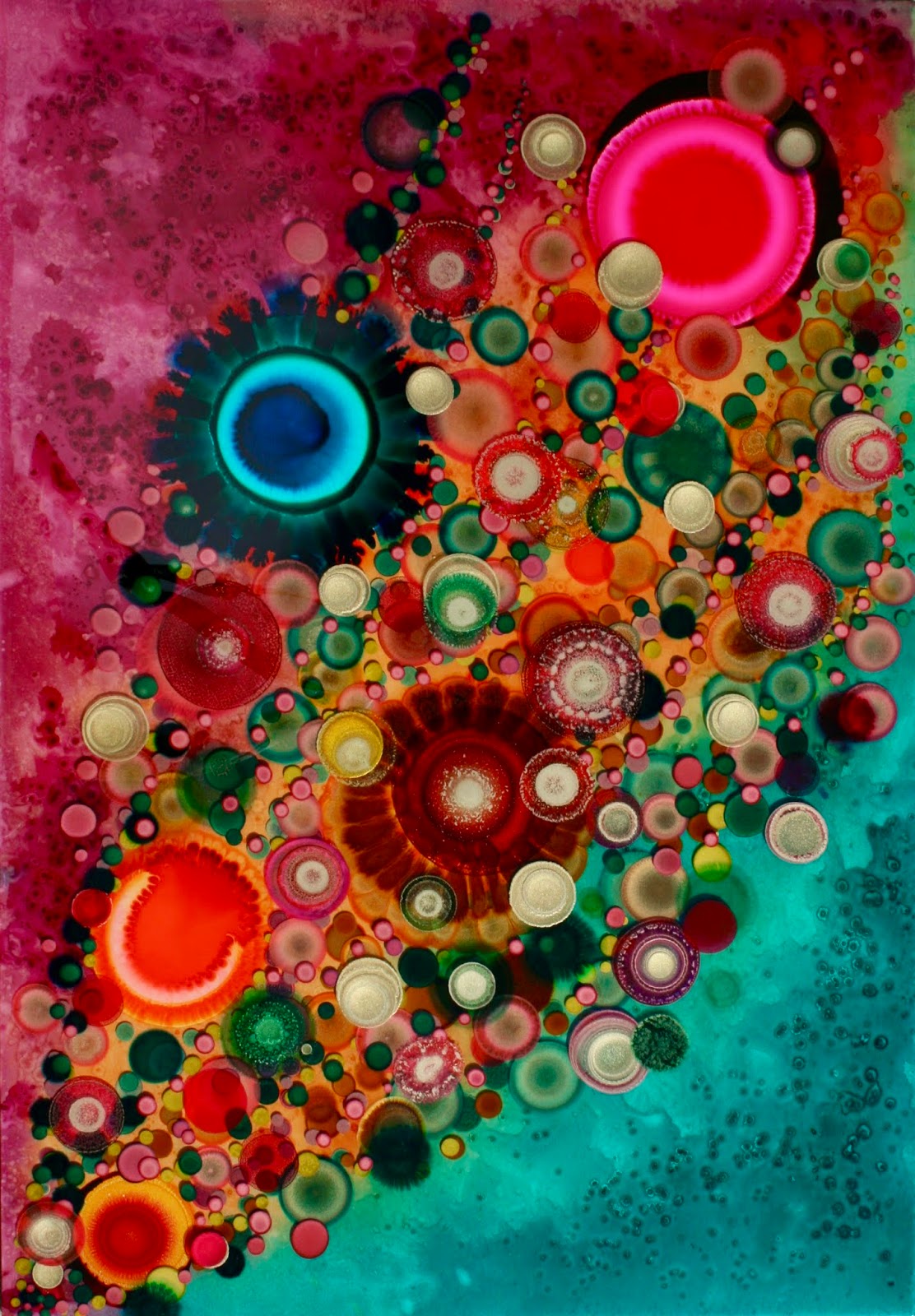
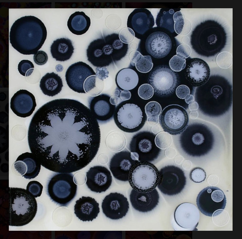
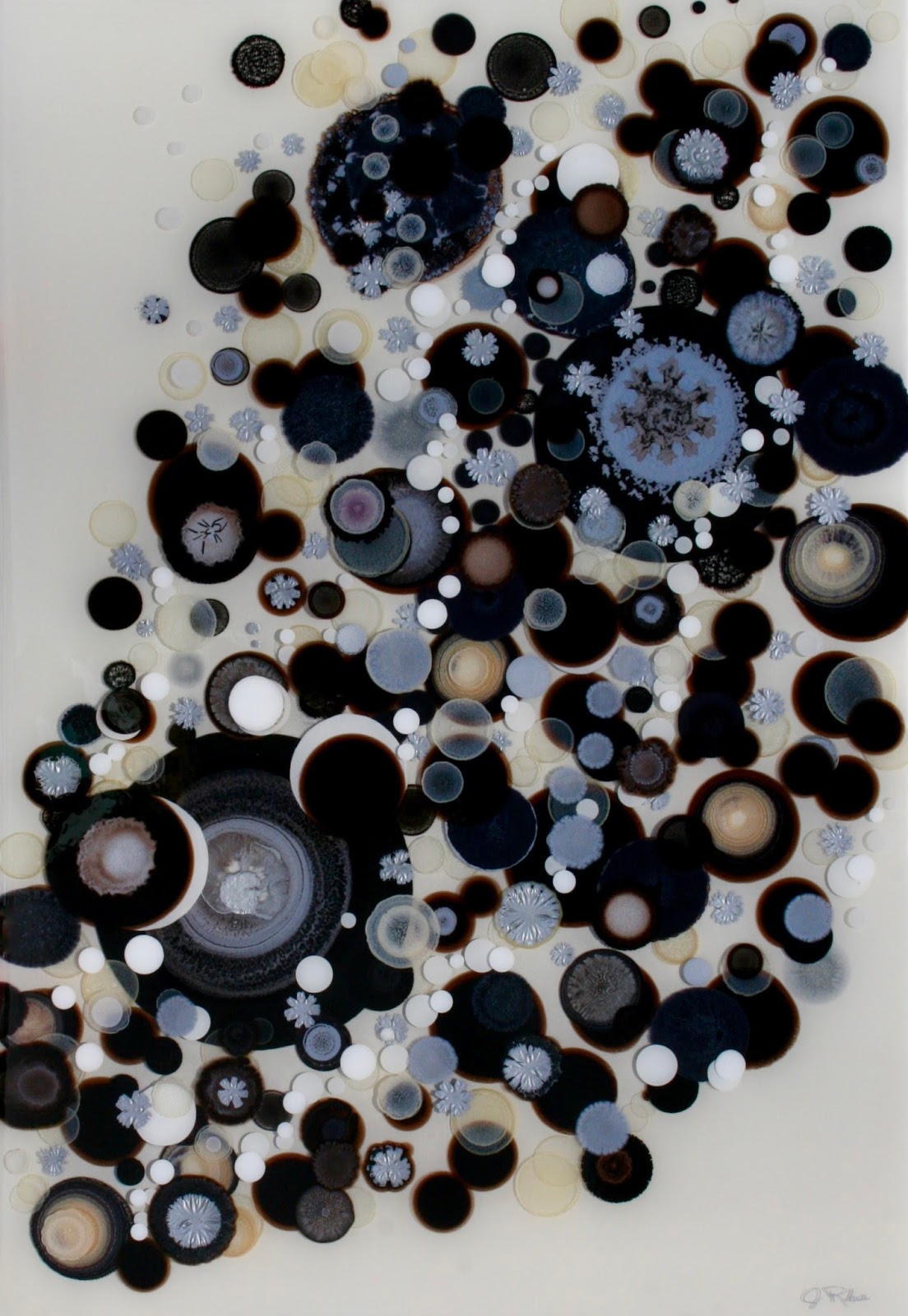
Most of my paintings feature circles. It is the creation of these circular patterns that is so intriguing to me. I occasionally paint with no circles, but my work is known for its circles, and the layering of circles upon circles. 

I usually work in color, size, or composition series.  I have several different styles—some with lines, some with up to ten layers of painting and resin that give the paintings a dimensional quality, and some with metallic or mirrored leafing. 

You can view samples of my ink paintings on my website. Here are a couple of paintings that show how one element or pattern is obtained by dropping one color into another color of ink. No tools are used except an eye dropper.  


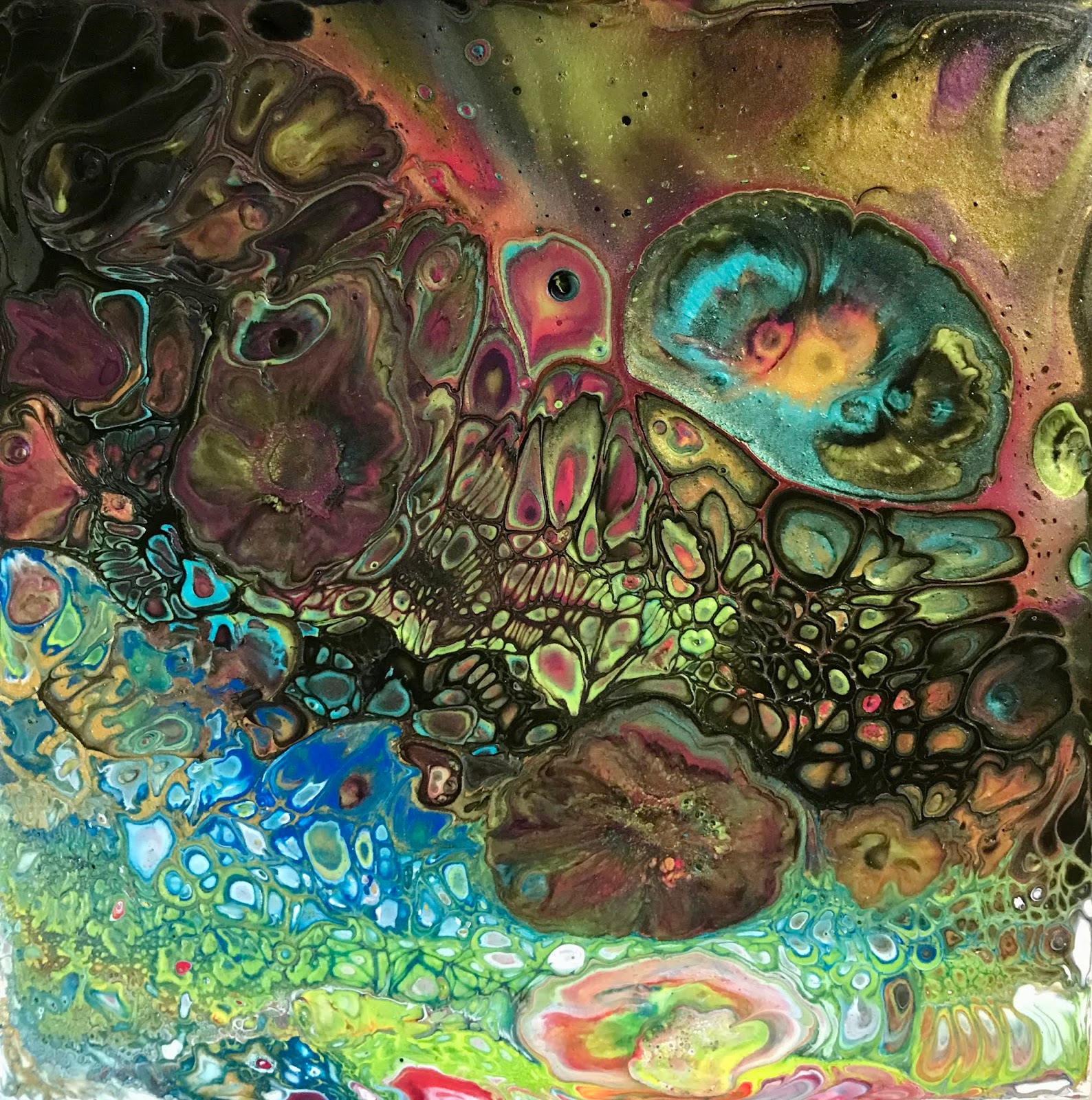
Acrylic pouring has a few similarities to my work, but still it is as different as painting with watercolors compared to oils. The similarities are that fluid acrylic artists usually work without brushes, and most often they float and tip to spread the paint.  They most often use silicone (which I do not use in my ink paintings) that makes it easier to create the cell patterns that many desire. However, these are still uncontrollable to a great extent—esp. the size, shape, color, and where they manifest in the acrylic pours. My paintings on the other hand have each major element as an intention or a deliberate action, and I choose the colors and the location of the elements.

Here are a couple of acrylic pour paintings that I have done.  You can see the cells that formed just as the patterns formed in my ink paintings. I did nothing except mix the paints and layer in a cup and flip it onto a board. It is very easy to see the difference in the effects as most of the designs are not symmetrical and most of the cells are small.


It is next to impossible to get a single symmetrical design element that is very large with acrylic pouring using most of the techniques that acrylic fluid painters use. 

You may have seen the videos of a variety of colors of paint poured through a kitchen strainer to obtain a flower or blooming pattern.  Except for a few designs such as those made by pouring one color of paint on another into a strainer or over a bottle, most acrylic pouring cellular patterns are anywhere from a few centimeters to an inch or two unless a tool such as a strainer is used to control the mix of the colors.  The ones that are larger tend to be one circle of one color paint poured into another circle of paint and on and on, but perfect circles are not the most often obtained patterns. One can get large areas that are flowing with acrylic pouring, but this is not anything like my paintings. I have been able to make a 24” in diameter circle with interesting symmetrical designs within much like a mandala. This is difficult with most acrylic pouring techniques. My large circular designs are caused more by a chemical reaction than the circles made with acrylic paint pours.  I do not use a strainer or any special tool to get my designs.

Yes, we are all masters by accident of acrylic pouring!  Even my two year old granddaughter’s first painting would have been considered a masterpiece.  ;)  However, there are those who have made their acrylic pours as backgrounds for their previously developed art style and their pours are now a signature part of their recognizable style. 

I do not want to make it sound like there is no control over acrylic pouring. To become good at it consistently, one has to do many pours. An acrylic fluid painter can work at developing paint formulas and color palettes that become recognizable as the artist’s work.  But it is very, very difficult to get to that point with acrylic pouring as there is so much left to chance.  I can name fewer than ten acrylic fluid painters out of the 25,000 acrylic pour artists in one forum I am on that I can put an artist’s name to their paintings the moment I see their paintings. So it is a real challenge to make a style one’s own with acrylic pours due to the lack of control with the process.  

I had made a post about eight years ago on artists who worked in similar processes as I work.  It is here if you wish to read it.  My next post may be on artists who work in a similar style as mine and have made it their own.


Thursday, May 31, 2018

Shades of Blue, Mermaids and First Friday

The Carolina Mixed Media Art Guild is having a member show at the Artists' Loft and Gallery in Wake Forest, NC.  

When:   First Friday, June 1st, 2018 between 6:00 and 9:00pm

Where:  156 S. White Street
              Wake Forest, NC 

Stop by and introduce yourself.  We love to talk art.

Our show is titled Shades of Blue and approximately 90% of the paintings should be blue.

I had planned on posting a sneak peek of the display, but was unable to get a good photo.

This is my submission to the exhibit.  


The Origin of Bubbles
16"x20"x2.5"

This painting is made with an acrylic pour and polymer clay mermaid, fish, seashells, starfish, and seahorse.  The bubbles are all alcohol inks in or on resin.  The resin is over an inch thick which gives it a very dimensional look.  

The photos below are closeups of the edges so you can see the layering of the paints and resin.  There are nine layers of paint and nine layers of resin. The resin is over an inch thick which gives it a very dimensional look.  


Detail of The Origin of Bubbles


Detail


A little about this painting...

Inspiration...

I was inspired to create this painting after watching one of our CMMAG members, Marcia Streithorst, make encaustic paintings of mermaids, and following one of the other artists of the Loft, Hannah Stayton, paint a different mermaid or "merfish" each day for the month of May.  She took a different fish each day and added a tail of that fish to make a unique mermaid or merman.  You can see all 31 of her paintings on Hannah's Facebook business page.  Pretty impressive to create a different one every single day for a month.

Process...

I have been doing some acrylic pours for a few years, but they are often not exceptional, but I have found that the ones that are not the best are the ones that work the best when adding other deliberate types of art to them. As you may know, a lot of fluid paintings turn out by chance to be works of art and many others are not quite up to what one expects or desires. This painting was all blues and had very little going for it, but that is what makes it work for the background for a mermaid.  

The mermaid was created out of polymer clay in 2006 for a CMMAG sign for a show we were doing as a guild.  Each member chose a letter of the Carolina Mixed Media Art Guild, and we each chose the medium we wanted to use for our letter. I chose the letter M and made a mermaid using the letter.  After the show was over, this mermaid sat in a drawer for twelve years.  Our guild encourages recycling, up cycling, reuse, and repurposing.  What better use for the mermaid than to add her to the acrylic pour that did not have enough going for it to be a stand alone painting.

I sculpted a fish, starfish, seahorse and a few seashells to go with her.

The bubbles are all alcohol inks.  Some have metallic or pearl pigment in them.  

The painting is on Ampersand Claybord™.

Come out tomorrow night and enjoy the evening of music, art, and friendship.


Saturday, January 6, 2018

Studio News

Jeanne Rhea Studio News

January 2018

53rd Annual Sanford Brush & Palette Club Art Show

I was thrilled that Cosmic Kaleidoscope was the winner of the abstract category for the Sanford Brush and Palette's 53rd Annual Art Show. It is alcohol and acrylic inks, and 

resin on Ampersand Claybord™.  The competition was stiff so I am beyond ecstatic to 

win this category again this year.


I also entered the oil painting below, World Within, in the abstract category.  It received 

third place.


New Paintings


Portal to Infinity
Each panel is 36"x18"x1".


Clockworks VII
24"x18"x1.75"


In other news

I took a trip to Alaska to install some paintings and to visit family and friends.  While 
there, I had two Accidental Painting classes-one for adults and one for kids.  I don't 
think I have ever taught any art that is as much fun as acrylic pouring.  It is rare for 
a participant to not want to do it over and over.  Below is proof that it is fun for young 
and old!

This is my two year old granddaughter pouring her chosen colors into her cup. She is already an artist!


Lots of fun making gingerbread houses with the little ones for Christmas. 
Always fun to see them make their own decisions on how they want their 
houses decorated.


If you are interested in an acrylic pouring workshop, please email me for available 

spots.


Happy New Year!


For 2018, I decided that I would enter one juried art competition each month.  It is difficult
to decide which Calls for Art to enter.

My alcohol and acrylic ink paintings have a high gloss resin for the final coating, and in
real life, they show their dimensional quality.  It is very difficult to obtain photos that
show this dimensional aspect, that  do not have hot spots, and the colors are true.
These challenges have been the reasons that I have not entered competitions when
judging is from photos.

I entered Frenetic Energy and was informed that I placed tenth in the painting category. What a surprise to start the New Year!  I can hear the thoughts a-whirring, "Tenth Place! That is not worth mentioning!" But I'll take it! There were thousands of entries and there were three categories.  There were ten awards and ten honorable mentions for each category.  So I am very happy to place in the top ten of the painting category.

This is Frenetic Energy in the All Women Art Exhibition by Light Space & Time Online Art Gallery.   To view other entries, click on the first link.

I look forward to submitting more artwork for juried shows.


2017 just flew by.  I am looking forward to 2018.  Each new year I reflect on the previous year and make a path for the New Year.  I have not made major goal changes for this year.
I want to continue to do my art, continue to improve, learn more, and hopefully, make this world a little better place for each of us.


Thank you to each of you who has offered kind words of encouragement, purchased my paintings, talked art with me, and shared your lives and passions. I appreciate every one 
of you!

If I have not met you in person and you wish to see my work in person in my studio, 
please contact me by email. I will be happy to set up a time and talk and show art!  If you are interested in attending a monthly Open Studio, please contact me by email for date and time.

Featured Artist at Artsy Shark

I was so happy to be the featured artist on Artsy Shark in July.  Such good company.  

Artsy Shark features a couple of artists each week, and also has very informative newsletters for artists and collectors.  

If you are an artist, it is a great resource with articles on the business of being an artist along with many other topics. If a collector, you will find lots of information on collecting art along with features on the artists who specialize in every type of art imaginable.  


NOTE:  I started this post July 12, and just realized that I had never published it along with two others. This is probably old news to most of you! 

Monday, June 19, 2017

Ink Paintings and Accidental Painting

This is a link to my most recent newsletter.  If you would like to receive it in your inbox, you can subscribe at the bottom of the newsletter.

I am still working on commissions. This is my latest one for a client in Anchorage, AK.  I had been working with black, silver, white and grays for over three months.  I had a request to add red to the color palette and paint one similar to The Mystery of Locus.   


48'x36"x2.25"
Alcohol and acrylic inks, resin
Ampersand Cradled Claybord™


The Mystery of Locus
40"x30"x2.25"


Here are some close-up photos of some of the elements in the above paintings.


Stay tuned for photos of the largest ink and resin painting that I have painted.  

The newsletter link above has more info about my process.  Read it for details if interested in process.  

Thank you for your support!


Sunday, February 12, 2017

The Challenge of Art Commissions

My fifth newsletter is online here.  Please subscribe on the bottom of the page if you would like to receive it in your email.


Over a year ago, I was asked if I would paint two larger paintings similar to one that I had previously painted with similar colors and design.  At first I declined. 

I was not sure I could reproduce the elements in the painting.  My painting process is more 'whatever happens, happens,' and I must work with whatever that is at any given time.  I loved the go with the flow process, and did not want my creativity stifled. It seemed that most people wanted specific sizes and colors for an area in their home or business so at the end of 2015, I vowed to not turn down a commission. I would at least try. 

With the first commission, I realized I had been missing an important part of being an artist.  It pushed me to try to create a painting with a similar aesthetic as another I had already painted. The only thing I really needed was a photo of one I had previously painted to get something similar.

So last year was filled mainly with commissioned work.  

This is the  painting titled Hidden Messages that I was to use for reference.


The two commissions below were painted for the MGM Hotel in Cotai, China.  These will be framed.


 Lucky Whispers I


Lucky Whispers II

Paintings are on Ampersand Claybord™ with an ArtResin™ finish.

Resin Studio Demo

My third newsletter is online here.  If you would like to receive it in your inbox each month, please subscribe at the bottom of it.

This past month has been busier than usual, but not busy as in hurry, hurry, hurry---just more commitments.  I am as always trying to stay focused on the task at hand while still taking a little time to dream, wander, and take it easy when possible.

I gave a demo last Sunday afternoon for some of our Carolina Mixed Media Art Guild members and a couple of our Sanford Brush and Palette Club members on how to use a two part resin and a few other short demos on using Jacquard silk fabric dyes and salts to create backgrounds.  A few participants painted with alcohol inks and applied resin to their paintings.

I used ArtResin for the demo. With about twelve people in my studio sampling resin, I wanted to be sure the odor was not overwhelming to those who are sensitive to resin. I heard no complaint about the odor of this resin unlike other resins I have used.  ArtResin is a superb resin in many ways.  If you wish to know more about it in comparison to others, you can read about it here.  

Each person applied resin on at least two paintings.  I had planned to take photos of participants and their art, but forgot.  These were some of the ones that were left in my studio to cure.  (Permission was granted to post these images.)

Elena Gage brought several of her Pēbēo paintings to test the effect that resin had on them.  They had been painted over a week earlier. This is important if applying resin over Pēbēo.  These are some of her first paintings and they are wonderful, but even better in person!


These are a couple of photos of Cathy Hooper's alcohol ink paintings that she did at the studio and applied an ArtResin™ finish. These are on Ampersand Claybord™.


I enjoyed doing this demo so much that I have plans to do this type of activity once a month in my studio.  It will be a potluck demo--anything that I have a 'taste' for at the time and the supplies that I have on hand so participants can experiment using their own style and art.

If you are interested in attending, the demos will most likely be on a Sunday afternoon in my studio in Sanford.  Please email me and I will put you on a notification list. Demos will be limited to 15 participants.  There will be a jar for donations---no more than $5 per person. This money will be donated to the Sanford Brush & Palette or the Carolina Mixed Media Art Guild.  

Sorry, I cannot tell you what I will demo until I stumble across it! 


Thursday, January 5, 2017

Greetings for the New Year and a Giveaway


My second newsletter is online here.  If you would like to receive it in your inbox, please subscribe. 


Yellowstone Caldera 
#1700
12"x6"x2"
Pēbēo paints, Resin on Ampersand Claybord™

This year I am going to try something a little different.  I create many samples in order to test different inks and paints.  I often turn these into coasters, magnets or pendants. 

I asked Facebook friends to title the above painting. Diane C. Keever suggested something Yellowstone____.  So I have titled it Yellowstone Caldera. I will be sending Diane a coaster that was made while testing the paints to make this painting. She will recognize the experiment in this painting. 

I am an abstract painter, but over the years I have found that people want a hint in the title of what I see in a painting, and I have come to the conclusion that a title is very important even for abstract paintings---and maybe even more so!  Usually, I like a title that still leaves it up to the viewer's interpretation. Some paintings title themselves just like I often think some paintings paint themselves.  

Watch for the next painting that I paint to see if I ask for a title.  I will keep all the suggestions that I received from this Facebook post and if I should use one of those in the future, a coaster will be coming to the person who titled it.

The remainder of this post is for the artist or crafter who works with resin.

I work a lot on Ampersand Claybord.  I do my tests on the 1/8" flats of Claybord.  It takes some skill to apply resin to small flat pieces and to avoid runoff of the resin.  It is much easier for me to apply resin on a painting that is 36"x36"x2" than it is to apply resin to six 4'x4"x1/8" flat pieces.  

Due to the porosity of the Claybord, the first layer of resin usually does not have a runoff problem.  But additional layers allow the resin to run more freely and over the sides and under the flat panel. Until recently, I was just always extremely careful trying to be sure as little resin as possible would run under the flat piece.  If it did, I would use a belt sander and sand all the resin off the bottom.  This is a lot of work!

In order to prevent the resin from running over the sides and ending up on the bottom, I sometimes use blue painter's tape and cover the entire bottom of a flat panel.  Sometimes if doing a large flat piece 8"x8" or 12"x12" for example, I cut a square of typing paper and only tape around the panel just up to the edge.  The paper for a 8"x8" piece may be 7"x7" and the tape covers the extra inch with just a little over the paper.  This can easily be removed once resin has cured and there will be no resin on the bottom of the panel. 

I ran out of blue tape and had to improvise.  I discovered that Reynold's Plastic Coated Freezer Paper ironed onto the back of the Claybord pieces would prevent resin from building up and having to be sanded off once cured.  It can be a little tricky to determine how much heat and for how long to iron, but with a few practice sessions, it is easy to get it just right.  After pouring the resin and it has cured, then pull the paper off to have a clean back surface.  Here are some photos.


Turn your flat panels upside down on your ironing board.  Cut a piece of freezer paper large enough to cover them while leaving space between them.


Do not use steam, but iron on high heat until paper is attached to the panel.


Allow to cool and then flip over and remove the paper.


Paper peeled right up almost completely clean on all except one of the coaster size panels.


This is one where some of the paper stuck.  It can be removed with water and a scrub pad.


Completed coasters! 

I still prefer blue painter's tape on the back, but using freezer paper is cheaper and if in a pinch, it can be a life saver!